The Indian Mutual Fund AUM is nearing ₹80 Lakh Crore, yet our penetration remains low (just ~20% of GDP). Why?
Because,
- The investor journey is broken.
- Millions are still misguided by suboptimal advice because the fundamental process of portfolio review is a chaotic mess.
List of Topic Covered
Problem Statement
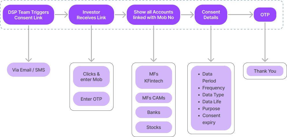
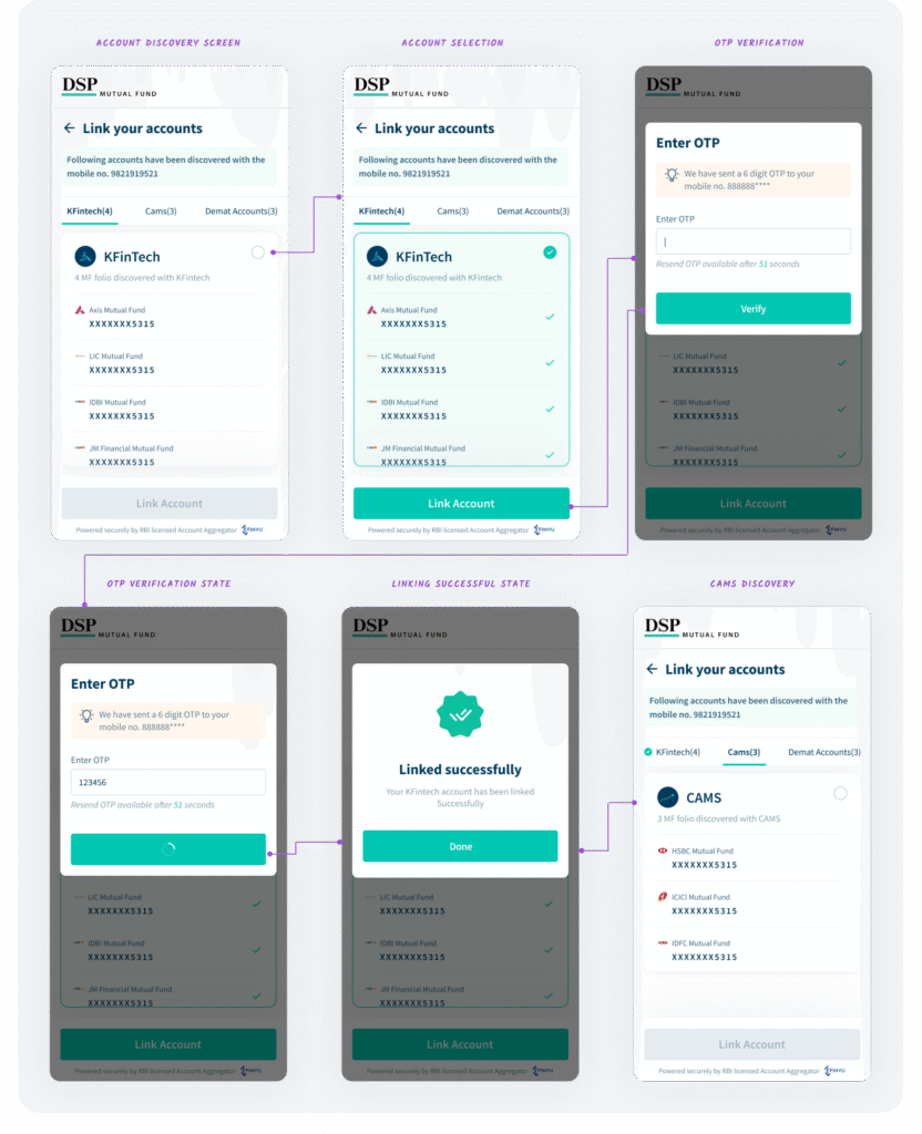
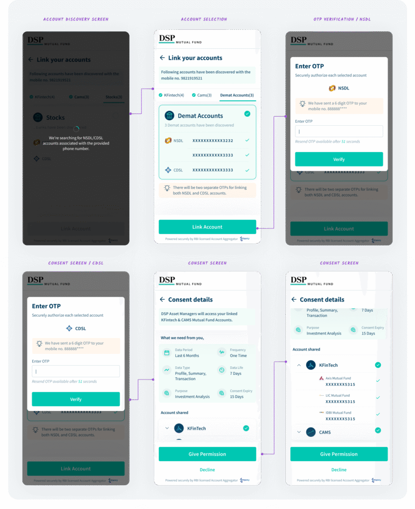
Investors currently share their mutual fund and stock portfolio details manually (via PDFs, screenshots, or emails), which is time-consuming, error-prone, and lacks real-time accuracy. This results in poor portfolio reviews and suboptimal financial advice from advisors.
Objective
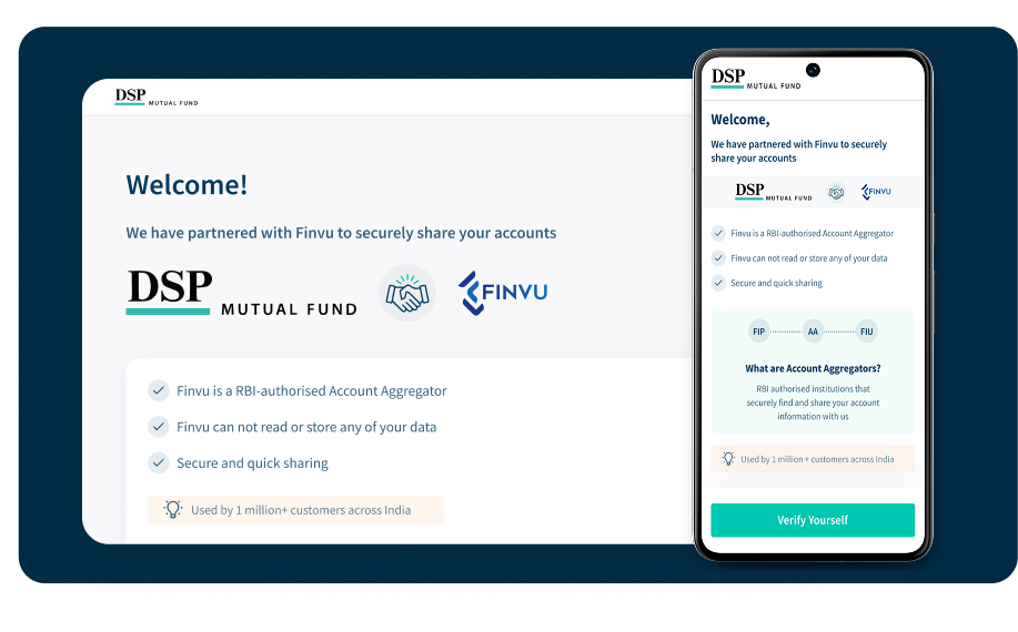
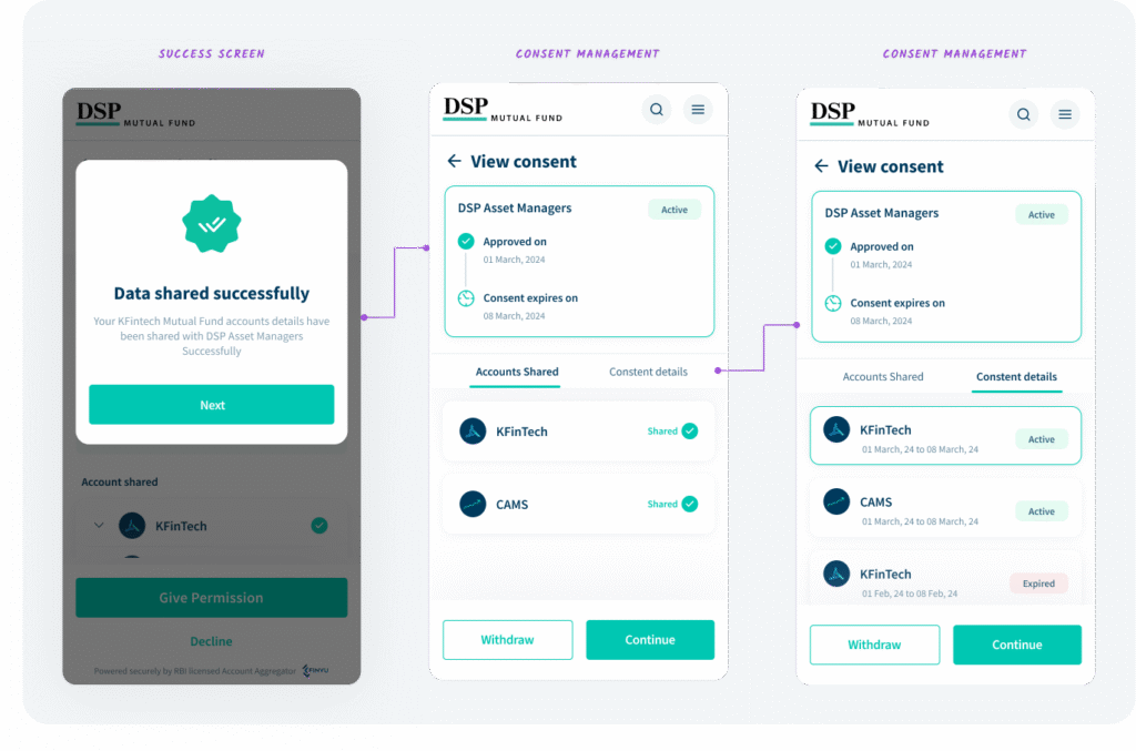
To streamline and digitize the portfolio sharing and review process by integrating the Account Aggregator (AA) framework into the DSP mutual fund Web/App, enabling advisors to access real-time, consented financial data securely.
Goals
- Enable investors to give one-time digital consent to share their portfolio data.
- Provide advisors with a unified and real-time view of mutual fund and stock holdings.
- Enhance trust and transparency between investors and advisors.
- Eliminate manual document sharing (like PDFs or screenshots).
- Improve portfolio insights for timely and informed recommendations.
Design Process
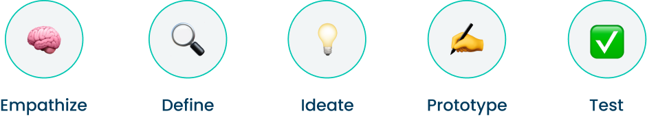
We receive a problem, conduct interviews with stakeholders (investors, advisors, and distributors), define a clear problem statement, and then work on ideas by brainstorming with PMs, designers, and the development team. We create wireframes and prototypes, and test them with users to gather feedback.
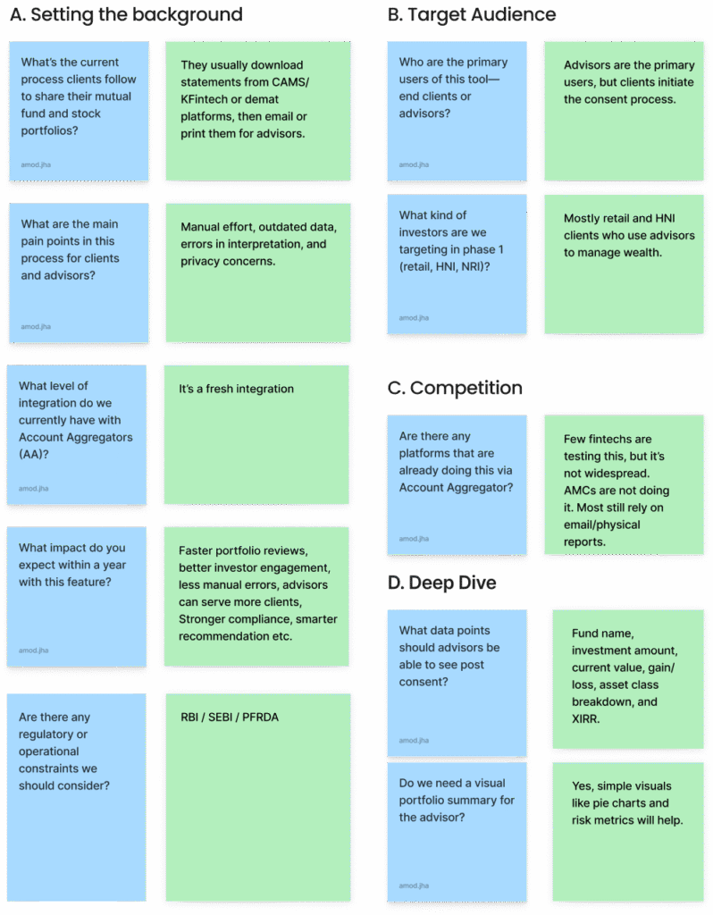
Understanding stakeholders , Investors, Distributors
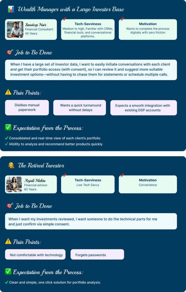
Personas in “Jobs to Be Done” (JTBD)

Information Architecture (IA)
Style Guide

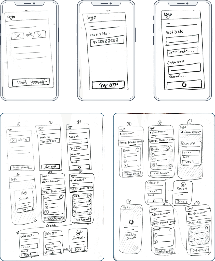
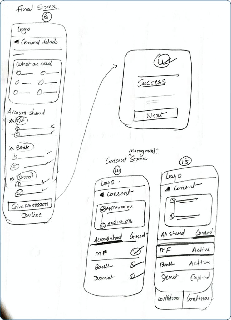
Wire Frames
A wireframe is the basic blueprint or skeletal outline of a digital product (like a website or app). It is a very important step before designing the high-fidelity visual screens. We take approvals on the wireframes from product heads and gather feedback from users as well, and only then start the actual visual design. It uses simple lines, boxes, and placeholder text to show what content goes where and how the structure works, without worrying about colors, images, or detailed styling.
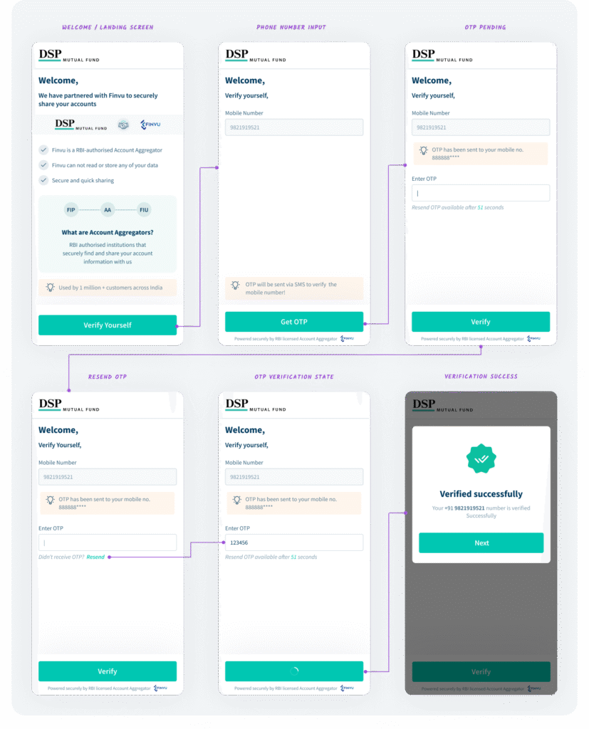
Visual Design (High Fidelity Screens)
After taking necessary feedback and recording all the points, we then start with the high-fidelity design. This is the final, detailed version of the product’s look and feel. It includes all the visual elements exact colors, typography, images, branding, and interactive components making it look and function exactly like the final product before it’s coded.
Edge Cases
What are edge cases in UX design?
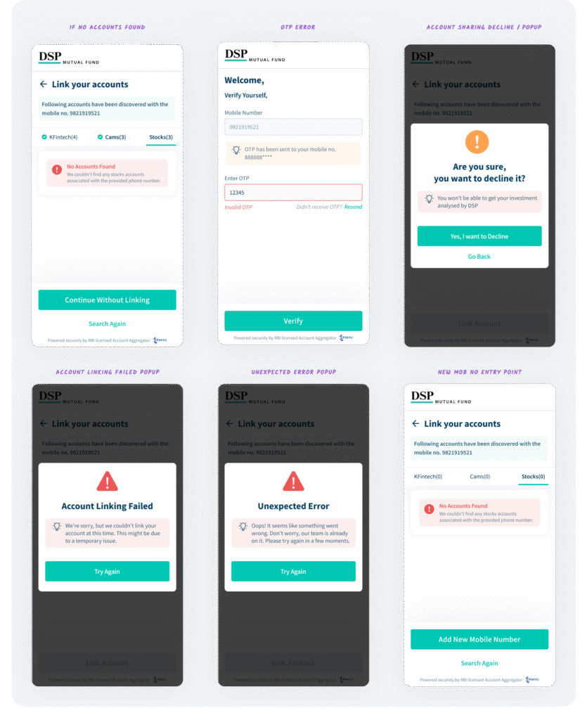
Edge cases are the infrequent, extreme, or unexpected conditions that fall outside the happy flow, such as a lost connection, an empty state, or an error during a critical step. Designing for these scenarios ensures the product remains robust, reliable, and user-friendly even when things don’t go as planned, preventing frustration and abandonment.
I have designed screens to handle the following critical edge cases, ensuring a robust user experience:
- No accounts found
- OTP errors (invalid input/timeout)
- Account sharing decline popup
- Account linking failed state
- Unexpected error popup
- New mobile number entry point
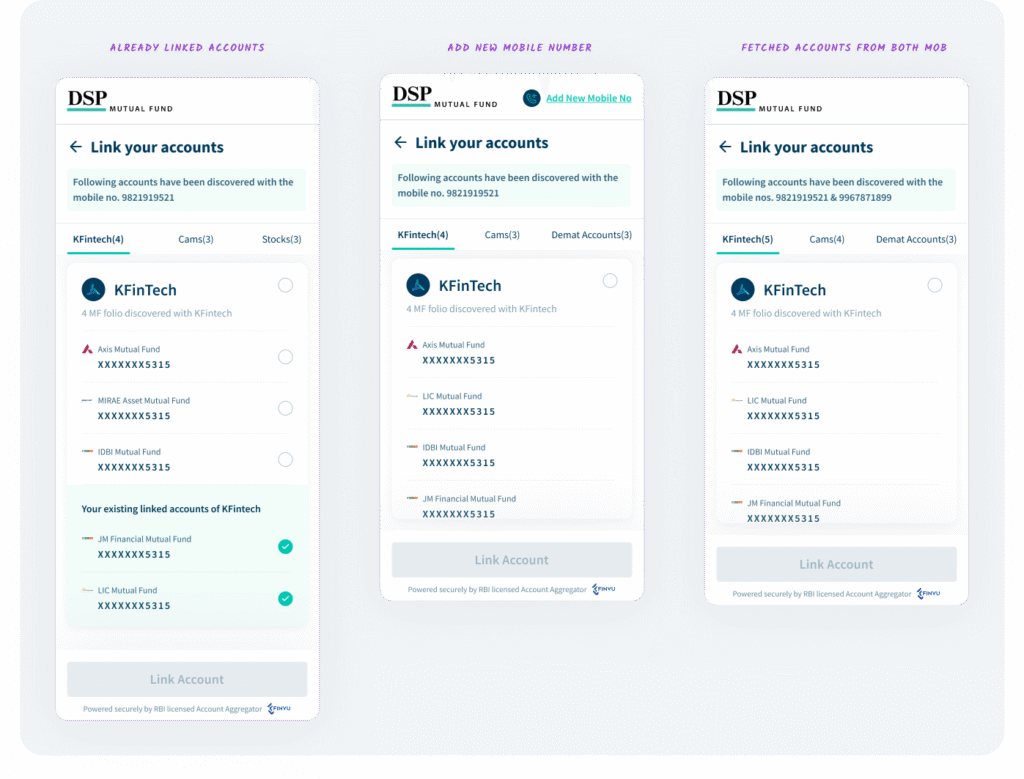
- Already linked accounts
- Adding a new mobile number
- Accounts fetched from both mobile numbers (e.g., KFintech and CAMS)
These screens are crucial for a complete and reliable user flow.
Thank You
Thanks for checking out my work! Interested in seeing the live prototype or want to share your thoughts? Leave a comment below, and I can share a prototype link also we can schedule a quick discussion to connect on this design.