
A UX case study on consolidating a fragmented redemption journey into one clear decision moment from my time at DSP Mutual Fund.
List of Topic Covered
Why smooth redemption matters
Many Indians keep most of their money in savings accounts, earning around 2–3% interest, even when better investment options are available.
One reason is simple: access feels easier.
With a bank account, withdrawing money is easy and quick but with mutual funds, FDs, PPFs and other investments, redemption can feel complicated and time-consuming.
That creates a trust problem. If people are not confident that they can access their money easily, they may hesitate to invest in the first place.
A smooth redemption experience can change that. It gives investors confidence that their money is not locked away and can be accessed when they need it.
This case study covers a redemption-flow project I worked on during my time at DSP, focused on making redemption simpler, clearer and easier for investors.
The problem
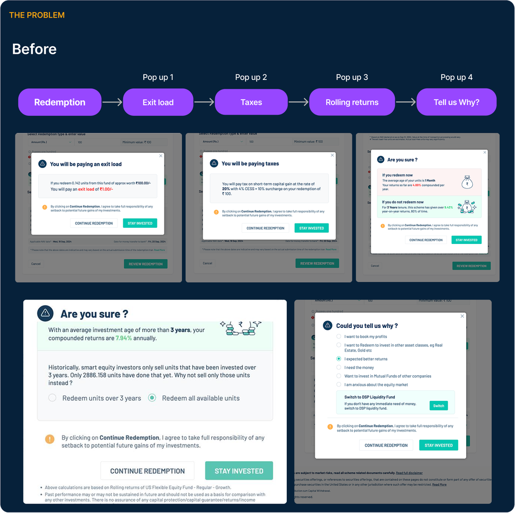
During redemption on the DSP portal, before a user could confirm a withdrawal, they were shown three separate popups, one after another listed below:
- Exit load : An exit load is a fee that may be charged when an investor redeems units within a specified period, depending on the mutual fund scheme.The question for the user: “Will I pay a charge if I redeem now?”
- Taxes : When a mutual fund is redeemed at a gain, the transaction may create a capital gains tax liability. The impact can differ depending on whether the gain is classified as STCG (Short-Term Capital Gain) or LTCG (Long-Term Capital Gain). The question for the user: “How could this redemption affect my taxes?”
- Rolling returns : Rolling returns show how an investment has performed across different periods rather than from just one fixed start date. In this journey, the intent was to help users understand the potential opportunity cost of redeeming now versus remaining invested. The question for the user: “What potential returns could I be giving up by redeeming today?”
Each popup had its own Stay Invested and Continue Redemption buttons, so users effectively had to say “no, I still want to redeem” three separate times before even reaching the actual redemption review screen.
Why this was a problem
- Repetition fatigue. Dismissing the same style of warning three times in a row trains users to click through without reading which is the opposite of the intended effect.
- Flow breakage. Every popup is a context switch. Three in a row made a simple withdrawal feel like an interrogation.
- Information got lost. Because each message competed for attention independently, users often missed the one that actually mattered to their situation (e.g., someone with a large capital gain would benefit most from the tax popup, but might have already gone numb to popups by the time it appeared).
- No holistic view. Users never saw exit load, tax impact, and return trade-off together as the three numbers that should really be weighed as one decision.
The Stakeholder Ask
Around the same time, a business requirement came in:
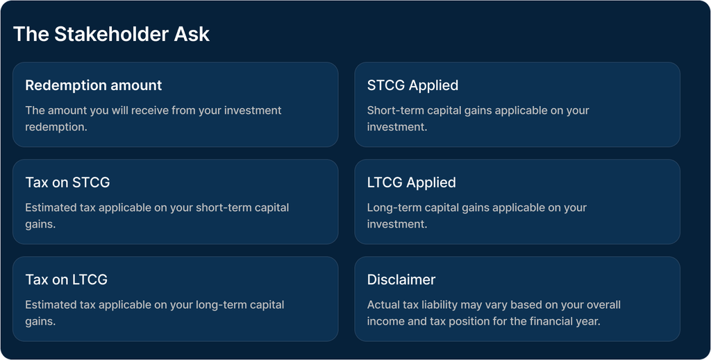
CAMS (the registrar handling capital gains computation) would provide an API returning the exact tax amount on a redemption Which will include CESS and surcharge rather than the rough estimate previously shown. This was the trigger to not just patch the tax popup, but to rethink the whole sequence. New data points the design needed to surface as listed below:
The Design Challenge
How might we help investors make an informed redemption decision without making the journey feel difficult or restrictive? The design needed to:
- Reduce unnecessary interruptions.
- Make the key financial implications easy to scan.
- Provide detailed tax information when required.
- Preserve the business intent of encouraging thoughtful redemption.
- Ensure the user could still proceed with redemption without being blocked.
The Solution
One Redemption Summary instead of three popups
The core change was structural. Instead of showing three separate screens, we consolidated everything into a single Redemption Summary.
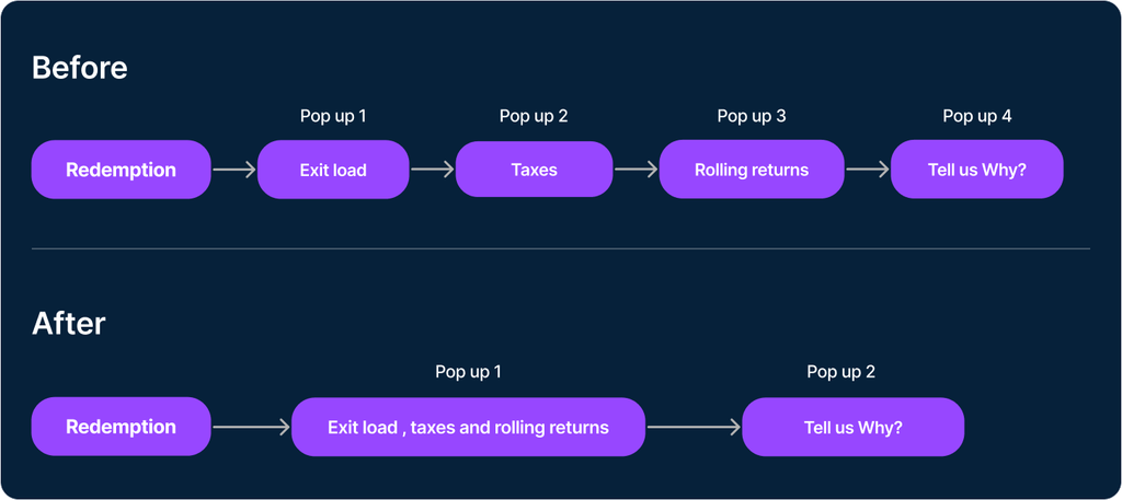
This reduced the forced interruptions from three to one, while keeping the relevant information available to the user.
Designing the Redemption Summary
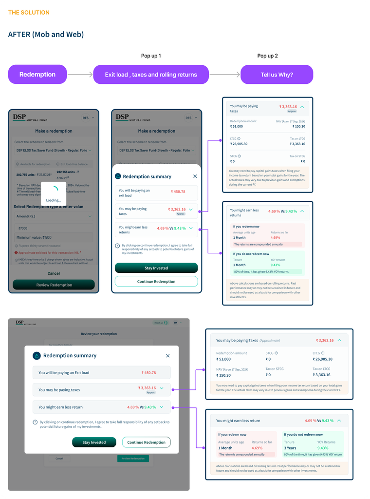
Exit Load
The user first sees the applicable exit load amount. “You will be paying an Exit Load: ₹X” No additional interaction is required unless the user wants more information.
Tax Impact
The tax section provides a high-level amount first. “You may be paying Taxes (Approximate): ₹X” Users can expand the section to understand the calculation:
- Redemption amount
- STCG
- Tax on STCG
- LTCG
- Tax on LTCG
- Applicable disclaimer
Rolling Returns
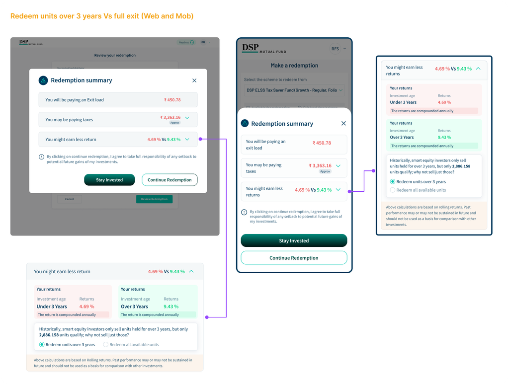
The collapsed state communicates the potential difference in returns. For example: “You might earn less returns: 4.69% vs 9.43%” The expanded section provides more context around redeeming now versus continuing to hold the investment. Where relevant, the experience could also suggest redeeming only eligible units rather than the entire holding.
Redeem Units Over 3 Years vs. Full Exit
Key UX Decisions
- Progressive disclosure
Show the important number first. Details on demand. - One decision moment
One consent and one CTA pair instead of three repeated interruptions. - Relevant information first
Prioritise the applicable tax component instead of highlighting ₹0 values. - Inform, don’t manipulate
Keep tax information factual while using returns to communicate opportunity cost.
Outcome
- The redesigned experience: 3 → 1 Reduced three forced interruptions to one consolidated summary.
- One decision moment : Exit load, tax impact and potential return trade-off could be considered together.
- More information, less complexity : Detailed STCG/LTCG information was accommodated through progressive disclosure.
- A more balanced experience : The design retained the business objective of encouraging thoughtful redemption without making the user fight through multiple confirmation screens.
The redesigned flow was shipped and is live in the DSP app.
What I Learned
This project reinforced an important UX principle for me:
Good financial UX isn’t about hiding complexity. It’s about revealing complexity at the right moment.
The biggest improvement wasn’t removing information.
It was changing three disconnected warnings into one coherent decision.
When better data became available, the answer wasn’t to add another screen — it was to use that data to make the existing experience clearer, calmer and more useful.
Write your thoughts in the comment box.