
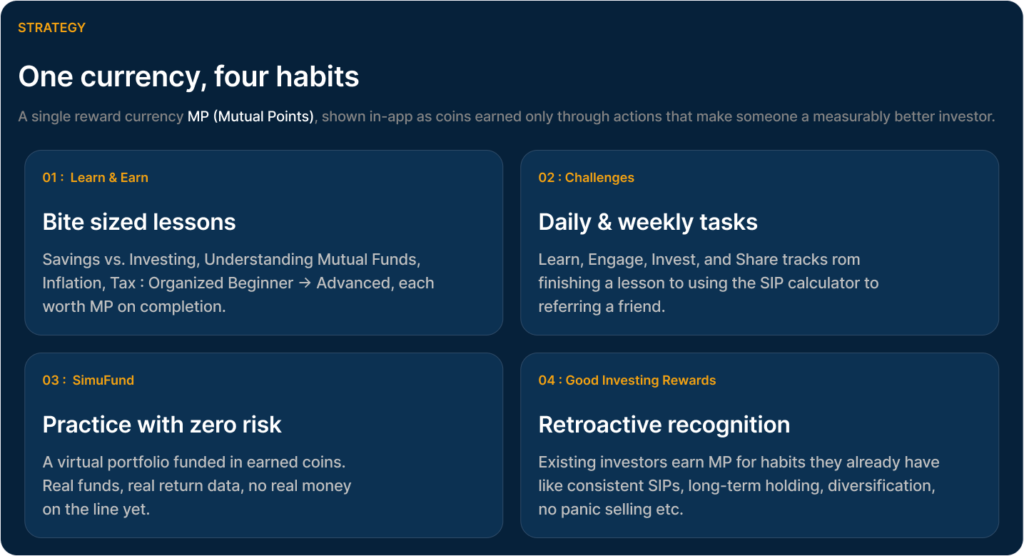
Turning fund browsers into confident, repeat investors. A gamification layer for a mutual fund investing app designed to reward the habits that actually make someone a better investor, for two very different kinds of users.
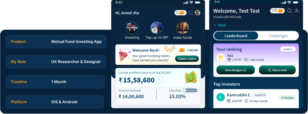
List of Topic Covered
THE PROBLEM : Two audiences, stalled at the same wall
New users just starting out and even experienced savers in their 30s and 40s, kept stopping after the most basic browsing. Mutual funds felt abstract and risky to newcomers, and choice-overload made self-directed investing feel unsafe for people who’d only ever used fixed deposits or an agent. Almost nobody was coming back.
OBJECTIVE : Design a gamified layer that rewards the behaviours that actually make someone a better investor learning, exploring, practicing, and sticking to a plan so the product earns repeat visits, deeper understanding, and long-term loyalty.
RESEARCH : Two very different starting points
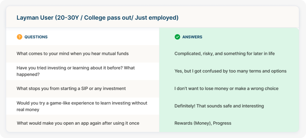
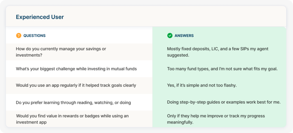
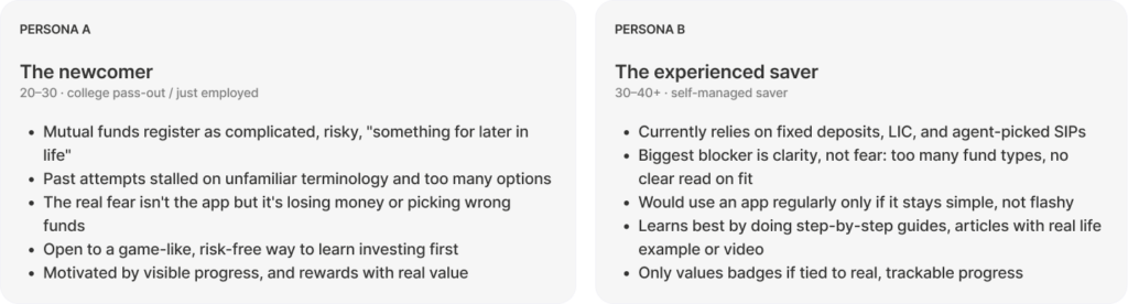
Before designing anything, I ran structured conversations with two segments to pressure-test assumptions about what “gamified investing” should even mean.

The Flow & Information Architecture
Rewarding the moments people drop off and end-to-end flow with new screens and reward moments layered onto the existing journey
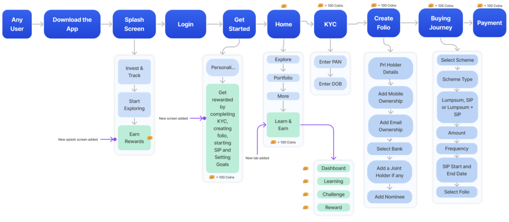
New onboarding beat : An “Earn Rewards” splash and short personalisation quiz arrive before Explore and gamification is introduced before any commitment is asked.
Milestones become rewards: KYC, folio creation, and the first SIP, the biggest drop-off points are now the biggest coin-earning moments.
A permanent home: A new Learn & Earn tab sits alongside Explore, Portfolio, and More, with its own Dashboard, Learning, Challenge, and Reward sections.
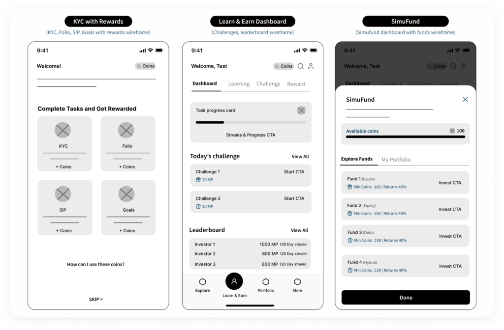
WIREFRAMES: Sketching the mechanics before the polish
Before any color, iconography, or copywriting, I blocked out the screens where the reward system lives so as to agree on hierarchy and information density with the team before investing in visual design.
THE EXPERIENCE : Walking through the product
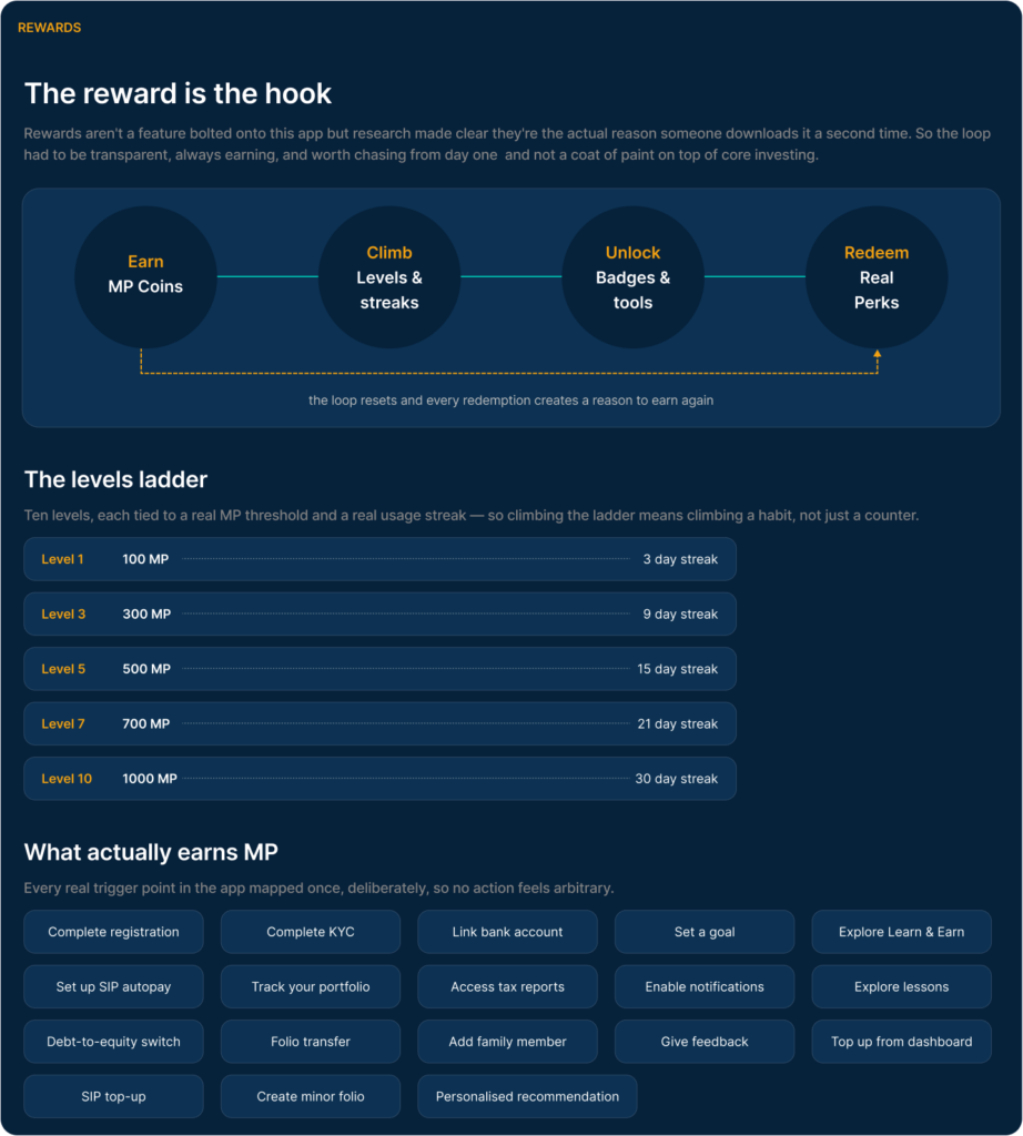
The first coin moments arrive during registration itself : Complete KYC, create a folio, start a SIP, set a goal, so a new user earns something the moment they take real action, not just for opening the app.
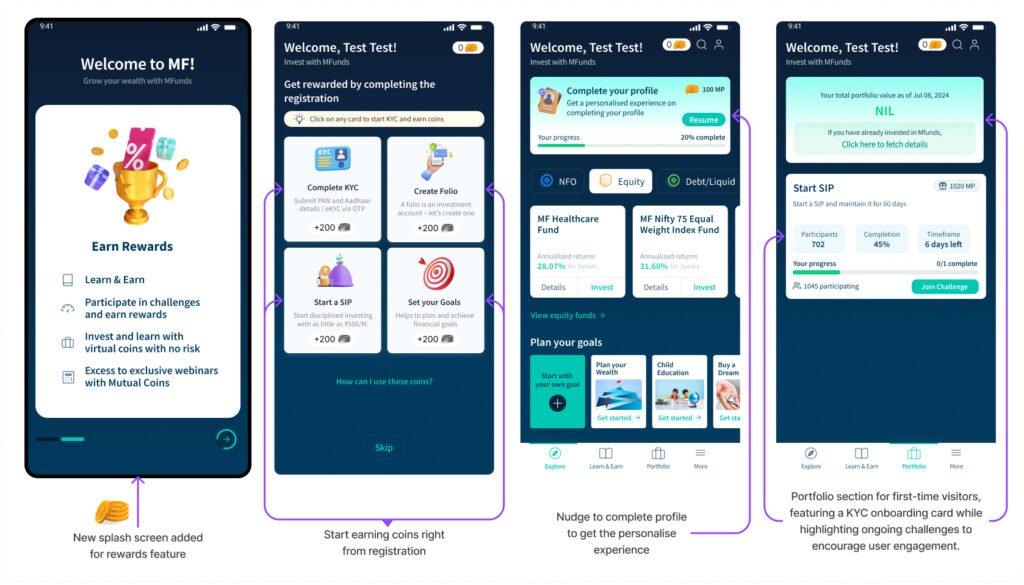
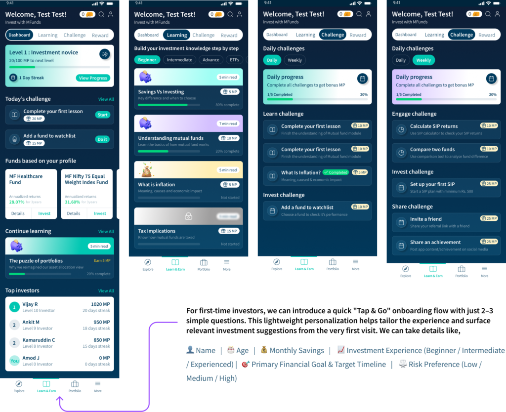
Learn & Earn : Dashboard, lessons, and challenges
A level and streak counter anchors the tab, personalized fund suggestions sit right below it, and challenges are split by type as Learn, Engage, Invest, Share so users always know what kind of action earns what.
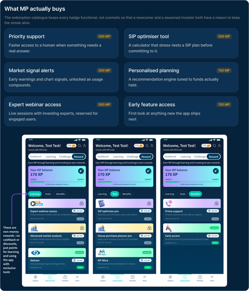
Rewards:
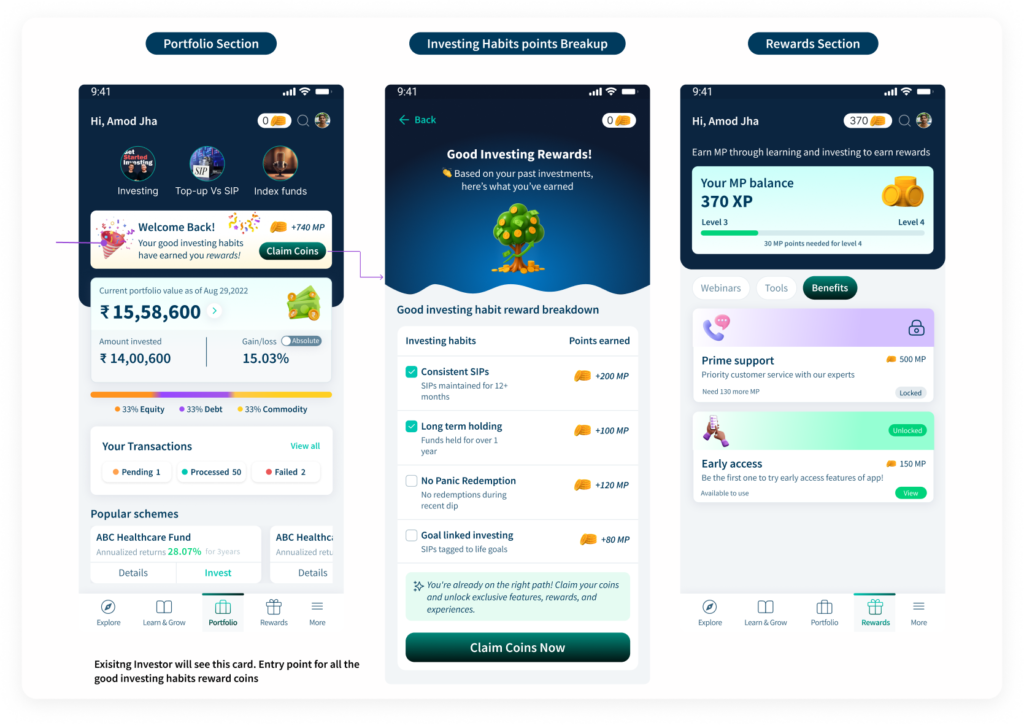
Good Investing Behaviour Reward (Existing Investor) :
It’s an opportunity for existing investors with long-term SIP , demonstrate strong financial behaviour like regular investing, staying calm during volatility, and maintaining long-term holdings. However, these actions are rarely recognised or rewarded. So we can reward them with coins basis their past investing behaviour.
SimuFund Investing, with training wheels
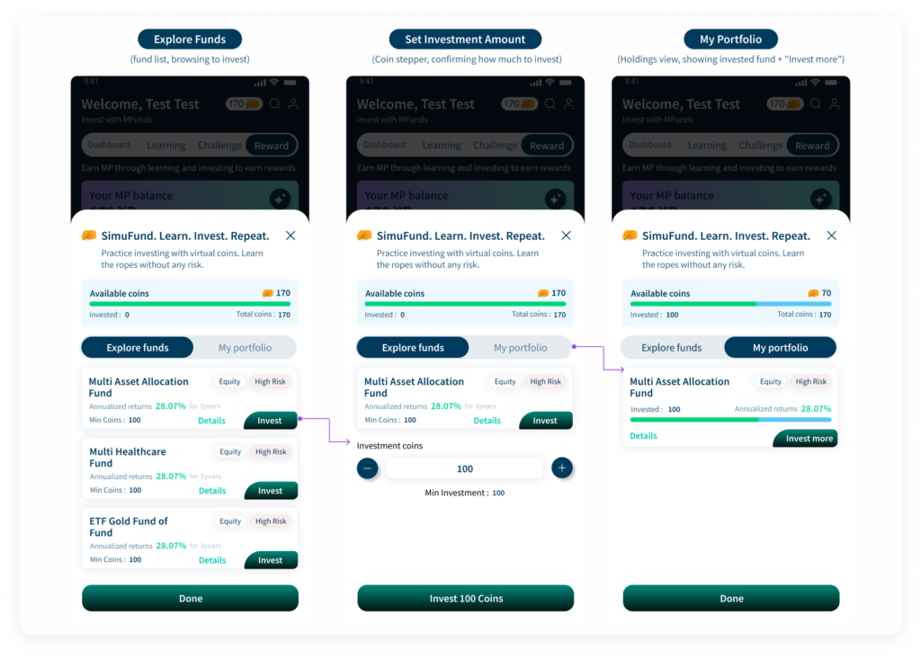
Users allocate virtual coins across real funds and see live annualized return data and building the muscle memory of investing before committing real money.
Leaderboard : Progress made visible
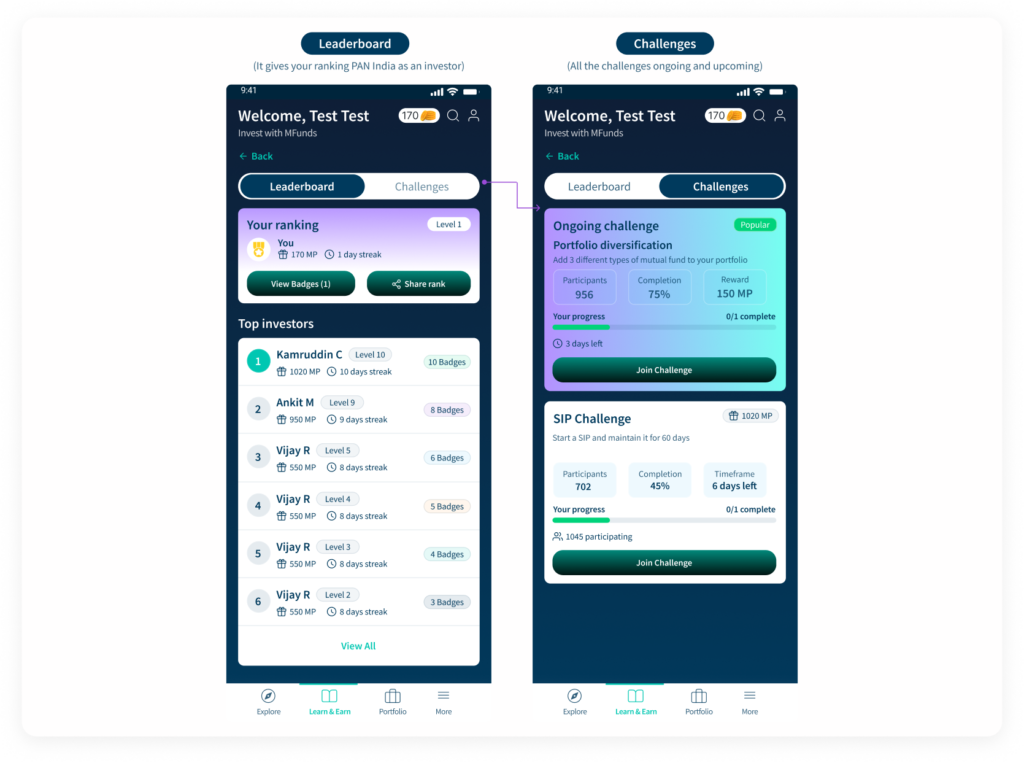
Rankings, streaks, and badges make progress socially visible, while active challenges like a 60-day SIP streak give users a reason to return this specific week.
Impact
Highlight
What I’d tell another designer
- Serious product, playful layer. Research was explicit: Experienced users only wanted gamification if it wasn’t “too flashy.” That constraint shaped every visual decision: coins and badges stay small and functional, never confetti-heavy.
- The reward should be useful to everyone: Badges shouldn’t just look good rather they should unlock useful benefits like webinars, tools, or priority support. This gives both new and experienced investors a reason to earn them.
- The hardest reward to design: Restraint. Rewarding “no panic redemption” meant designing for something a user didn’t do, rather than an action they took. A much harder thing to make visible and satisfying in an interface.
1 thought on “Gamifying Mutual Fund Investing : UX Case Study”